Weeknotes / 2023 / Week 42
It’s a nice Saturday evening, K and I just got back from a long walk (like the proper old people we are), so I think it’s a good time to write this week’s update.
Here’s this week’s earworm, from the Killers of the Flower Moon trailer:
This is the first one I’m sending since I’ve combined my blog and my newsletter.
Apart from the logistical unnecessity of having two audiences getting two different experiences, there were a couple of things going through my mind when I did that.
First, there’s no reason to work purely from inertia. Just because I was used to doing things one way doesn’t mean that’s how things have to go in the future. It pays to shake things up once in a while.
Also, I’ve been looking at how the audience of this blog is growing, and I noticed a funny thing. For the first few posts I made here this year, I’d post links to social media and then keep looking at my visitor stats every couple of hours, and there’d be close to nothing – 5-10 visitors since I posted, if that. And then I’d forget about it, and a few days later, I’d look at the stats and realise that the biggest visitor bumps were always a couple of days after I’d posted, easily 80-100 people at a time.
Twitter had trained me to think of engagement as something that happens in real-time, but blog engagement happens asynchronously, over days and weeks, and that’s a good thing. That’s what I wanted a blog for.
For example, I still have visitors in the tens every week who go back to read this post I wrote last year about The Bear. I get to see and feel that what I write here sticks around for a bit.
Anyway, welcome to the new iteration of this thing. I mentioned in the last newsletter that I would give this thing a name, but honestly, for now, I prefer these to be just posts you’re getting from me, rather than something I do under a rubric.
This week on the blog, I posted the Liltober drawings I’ve made so far, along with some commentary on what I was trying to do with each one.
Work-wise, I wrapped up The Oddly Pedestrian Life of Christopher Chaos #7 and sent it off. I also did a big chunk of pages on a graphic novel I can’t tell you about for a few years yet. We’ve been working on this since 2020, and it’s this big, beautiful thing that’s going to take its time. Let’s call it … OGN A, for whenever I mention it in the future.
The stylesheets I mentioned last week are approved, other than small tweaks on one of them. I expect to be lettering a big batch of these next week.
I also sent off a stylesheet for True Weird #9, and I’m waiting to hear back on it before I start working on the rest. Usually I’d just do the whole thing, since people are stylistically flexible about short comics, but the style I’ve chosen for this is eccentric enough that I needed to know that the team is happy before I do the whole thing.
Finally, I started work on w0rldtr33 #6, but will be finishing it next week.
In other news, as I was writing this very missive, the Hugo awards were announced, and Cyberpunk 2077: Big City Dreams – by Bartosz Sztybor, Filipe Andrade, Alessio Fioriniello, Roman Titov, Krzysztof Ostrowski, and lettered by me – won the Best Graphic Story or Comic award. Quite, quite cool.
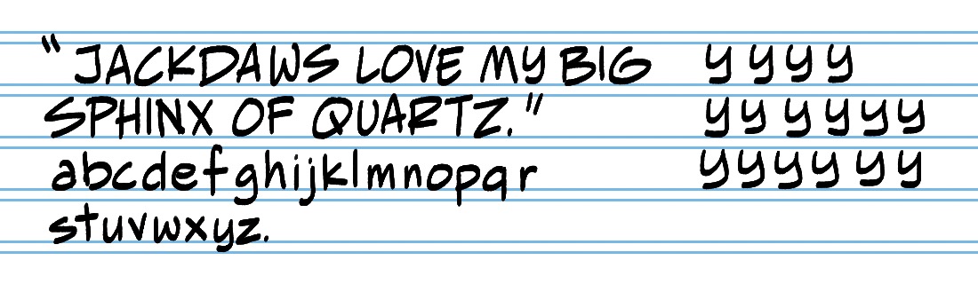
I started work on a new font, which is a big thing for me.
Before the pandemic, when I thought about stepping back from lettering work and doing something else that would enable a schedule that wouldn’t kill me, my big idea was to set up a comics font foundry on the lines of Blambot and Comicraft. I’d made a few fonts by then, and learned a lot in the process, and I was hoping to divide my days into 4 hours of lettering work and 4 hours of font design.
The nice thing about font design, of course, is that you’re making your own schedule, and unlike work-for-hire lettering work, you work on a font once and you can keep selling it and making money.
Apart from starting design work on my own fonts, I also solicited font design work from artists – converting their hand-lettering into fonts, basically. I did this for Nidhi Chanani and Michael Walsh, and had hand-lettering samples from Dani that I intended to turn into a font that she could use and I could sell as a collaboration (sorry, Dani!). In fact, that was the deal with Michael’s font too.
But then I had my physical breakdown (and, let’s face it, a bit of a nervous breakdown too) at the end of 2020, and as I lay in my parents’ house recuperating, I had a long think about what I wanted my future to look like, and how I wanted to spend my time.
I decided to focus on the one thing I can do well and that gets me well-paid – lettering – and spend the rest of my time doing things that would make me happy rather than what would make me money – so, writing and learning how to draw. Making fonts is enjoyable, but only part of the time. The design bit is fun, but everything after that – metrics, kerning, programming, testing – that takes up a majority of time and is not fun.
Anything that wasn’t a 100% yes was a no. (That’s something I’ve talked about in the newsletter around that time.)
So I put aside this idea of creating fonts (though I kept using one of my fonts, and recently sent that one to Hass so he can use it on an upcoming project), and focussed on lettering, and even there, prioritising projects with backend agreements.
So – why this, why now? As I mentioned in one my previous Updates, I was supposed to be hand-lettering a couple of projects between this year and next, and had to transition both to digital.
I thought it’d be cool to have a font that looks as close to hand-lettering as I can make it – just one font, putting everything I have into it. I have a few projects coming up next year that I’m hoping this can be used for (including the second of those projects up there that I had to transition to digital).
Here’s a sneaky peek of what it’s going to look like. It’s still in the “doodle” stage, so I’ve finalised nothing other than the general style, but I think it’s looking pretty cool.
My pal and frequent collaborator Darcy van Poelgeest sent over the first issue of his upcoming comic with Caio Filipe, Patricio Delpeche and Nate Piekos, called Lotus Land, out from Boom Studios on November 15th.
Lotus Land is a beautifully drawn, coloured and lettered sf crime drama. It also has, from the very first page, Darcy’s characteristic humanity. Darcy is not a writer who spoon-feeds his readers, so at the end of issue 1, we have a limited idea of where the story is going to go, but if you’ve been following so far the stuff I like, you know that for me that’s a strength. At the same time, the story is grounded in its characters and in their relationship with their world – it has Darcy’s trademark attention to both atmosphere and to worldbuilding, and his occupation with how people interact with nature.
This is the kind of sf comics I want to be reading, and you should as well. The final order cut-off for Lotus Land #1 is Monday October 23rd, and you should let your local comics store know that you want this book!
Here’s Darcy talking about Lotus Land in his newsletter.
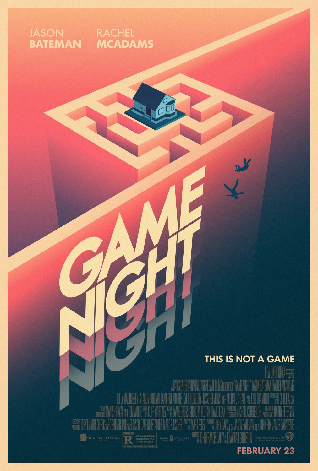
Movie-watching this week was a bit thin on the ground. K and I watched Oldboy, and then, because we needed something lighter after that, we watched Game Night.
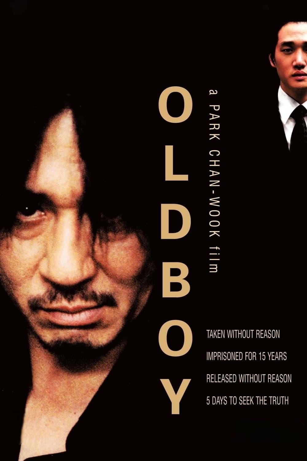
Oldboy is an old favourite of mine. It’s the first Korean film I ever saw, and both of its central male performances (Choi Min-Sik as Oh Dae-Su and Yoo Ji-Tae as Lee Woo-Jin) are awe-inspiring. Nearly twenty years after I first saw it, I was relieved that it holds up. The hypnosis bit is janky, but it was janky then as well. Other than that, the way the movie is shot, coloured, acted and choreographed absolutely holds up. I remember back then I was recommended this film because it was “so fucked up, man”, but watching it now, it just radiates sadness. It’s not making a meal out of its transgression, and it’s not invested in turning its protagonist into a superhero. Every “badass” thing that Oh Dae-Su does in the film has a layer of sadness or irony over it.
Finally, something that struck me on this watch – you always know that you’re watching a revenge film, but throughout, you think you’re watching Oh Dae-Su take revenge on the man who imprisoned him for 15 years. But by the end, you realise that not only was “the villain” always in control, in fact, the story was of his revenge against the man who caused his sister’s death, and the 15 years were merely a prelude to the events of the film.
Game Night worked well enough as a palate-cleanser, and it’s a pleasant film, but … folks, I gotta be honest, watching so many films over the last year that completely abjure three-act structure and the traditional Hollywood “main character learns something” narrative made me far too aware of how painfully constructed the arc of this film was. Nothing happens throughout that you don’t expect or that didn’t come out of a Screenwriting 101 book. Several of the jokes are quite good, though, and Michael C. Hall turns in a genuinely menacing performance in his two minutes of screen time.
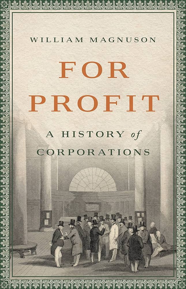
I finished reading For Profit and highly recommend it if you’d like a grounding in the history of corporations. It uses eight corporations from different points in history as a lens to view a particular innovation or characteristic of corporations (e.g. banks, monopolies, start-ups) and how capitalism developed over time.
Magnuson himself teaches corporate law and seems to be a firm believer in the idea that corporations can be a force for good, and in fact, spends a whole chapter at the end of the book envisioning how he’d fix corporations. But despite this, the book is grounded enough in fact that the overall picture can’t help but paint the corporation as a rapacious, ungodly construct that has done far more damage than the good it did, oh, way back in Roman times.
As long as you can indulge him in a bit of “oh, but they don’t have to be bad”, it’s a good history book for a layperson.
I also read Tatsuki Fujimoto’s Goodbye, Eri. I read the first one-shot he put out between volumes of Chainsaw Man – Look Back – back when it dropped on the Shonen Jump app, but somehow I missed that he put this out the very next month. (So the man takes a yearlong hiatus after 11 volumes of a manga, and puts out not one but two graphic novels during this so-called break.) I finally read it after it was officially released as a book this year.
I have some thoughts on Goodbye, Eri, but I want to reread Look Back and then read Eri again before writing them down. These are books about young creators, and one can read them both as being about Fujimoto’s feelings on being an artist and a storyteller, so I’d like to look at both of these through that lens before I talk about Goodbye, Eri, which I loved, to be clear – same as Look Back.
This one snuck up on me. Last night, I was on my feed reader (I’ve currently abandoned NetNewsWire and gone over to ReadKit – it’s a paid app, but it’s a cleaner, more holistic experience), and went to the Eruditorum Press feed, as I often do. Elizabeth Sandifer is one of my favourite critics, having written several excellent books on Doctor Who, apart from her current project The Last War in Albion and the excellent Neoreaction a Basilisk.
El’s work has often been a creative filter for me, encompassing as it does pop culture, history, creativity and experimental non-fiction. Her writing also helped me, when I was younger and more fannish, become less angry with what I then saw as the travesty Steven Moffat was committing with Doctor Who.[1]
So, I opened her latest post – “Queen Shit: the Case for Joan Baez” – expecting a 3-4k-word post on a singer I was only vaguely familiar with, and an hour later, I looked at the scrollbar and realised I was only about 10% of the way through. I did a quick word count, and turns out, for the second time in the life of her blog, El dropped a whole book in a single blog post.
“Queen Shit” is a 30,000-word appreciation of Baez’s catalogue, particularly her masterpiece Diamonds & Rust, seen in the context of her activism, her musical capabilities, and her position in pop culture of, at the time, being primarily known as “Bob Dylan’s Ex”. Helpfully, each song mentioned has YouTube video embedded next to it, so you can listen to the song itself while reading about it. The song analyses, based on context, range from the academic to the rousing to the touching (I’m not 100% certain I’d have noticed the intricate structure of “Prison Trilogy (Billy Rose)” without reading about it).
Needless to say, I stayed up half the night reading this, listening to each song as it came up, and it was absolutely worth it. Joan Baez has a new fan.
Here’s the link again if you’d rather not scroll up.
That’s it for the week.
You can continue following this by email, or, alternatively, you can add http://adityab.net/feed/ to your RSS reader. Either should get you (mostly) the same experience.
I’ve since mostly come around on his run, partly because of El’s writing, and when the 12th Doctor era came around, I was able to take it on its own terms rather than what it wasn’t doing that I wanted it to, and thank fuck for that, because that’s now my favourite run of Doctor Who. ↩︎