
Deicidium Book 1 Preview
I’m a little late posting this, since the final order cut-off for Deicidium: Returned was Monday, but …
IGN has an exclusive 26-page preview of the first Deicidium graphic novel – written by Ram V, with art by Evan Cagle and Anand RK, letters by me, and design by Tom Muller.
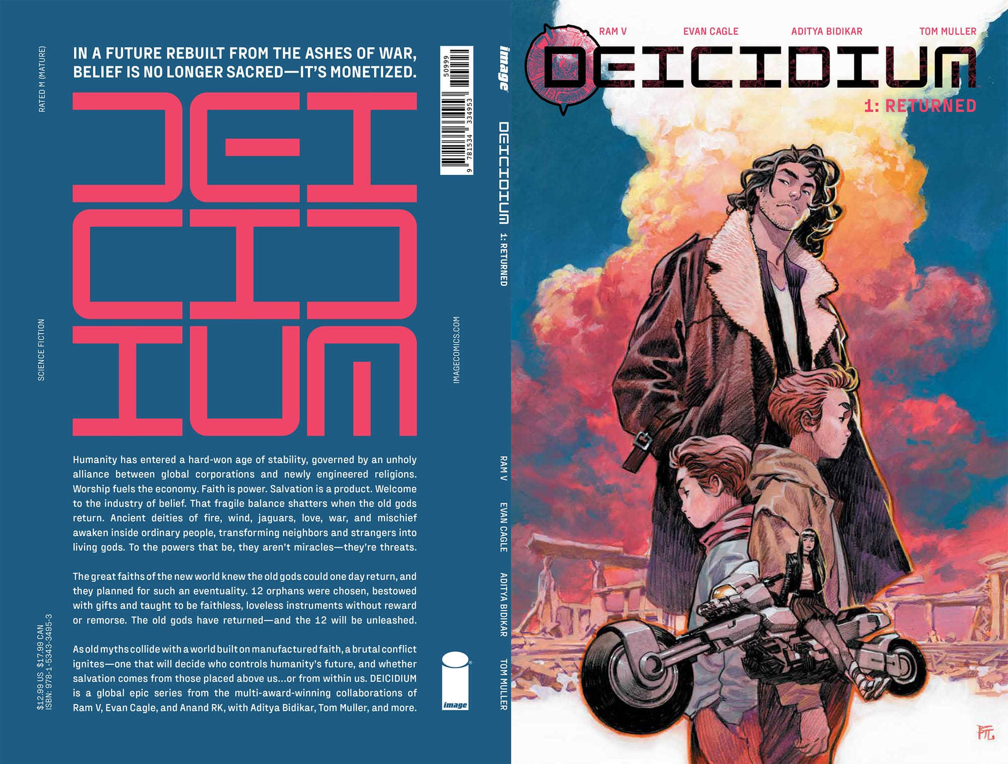
Here’s the official summary:
In a future rebuilt from the ashes of war, belief is no longer sacred – it’s monetised.
Humanity has entered a hard-won age of stability, governed by an unholy alliance between global corporations and newly engineered religions. Worship fuels the economy. Faith is power. Salvation is a product. Welcome to the industry of belief. That fragile balance shatters when the old gods return. Ancient deities of fire, wind, jaguars, love, war, and mischief awaken inside ordinary people, transforming neighbours and strangers into living gods. To the powers that be, they aren’t miracles – they’re threats.
The great faiths of the new world knew the old gods could one day return, and they planned for such an eventuality. 12 orphans were chosen, bestowed with gifts and taught to be faithless, loveless instruments without reward or remorse. The old gods have returned – and the 12 will be unleashed.
As old myths collide with a world built on manufactured faith, a brutal conflict ignites – one that will decide who controls humanity’s future, and whether salvation comes from those placed above us … or from within us. Deicidium is a global epic series from the multi-award-winning collaborations of Ram V, Evan Cagle, Anand Radhakrishnan with Tom Muller, Aditya Bidikar and more.
Deicidium: Returned is out on November 11th from Image Comics (in English) and Morgen (in French). It’s the first of a planned series of nine graphic novels.
I wanted to write a quick note on the lettering here, since we’re trying something new.
First of all, Deicidium uses the same new font that I created for In Your Skin, which I’m quite happy with now that I’ve seen it in action over 200 pages. I’m planning to add more glyphs and autoligatures to it over time, but it’s quite well-set as-is.
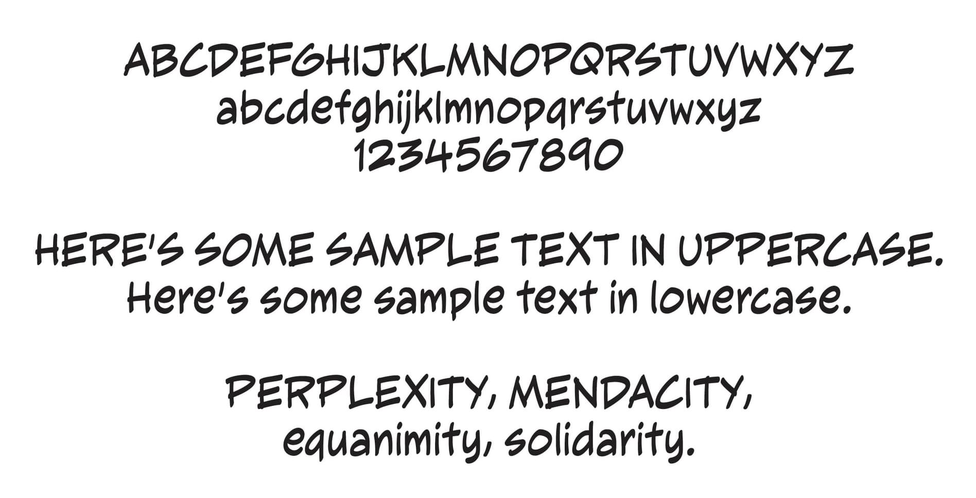
Second, since this is going to be an entirely black-and-white book, I wanted to play with manga-style lettering. I did offer the team a couple of other options for lettering and font styles, but we unanimously gravitated towards this. The idea is that when Anand takes over, we can retain the font and change the balloon style to suit his art, but for Evan’s pages, with his heavy manga influence, this felt right.
So we’ve got the hand-drawn balloons, stubby tails, and the inverted tail for off-screen balloons, which I also did for City Beneath Her Feet.
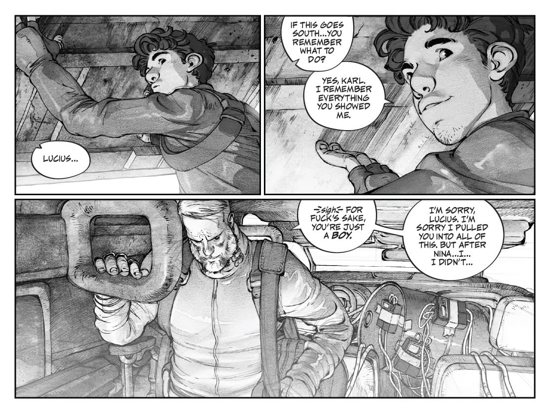
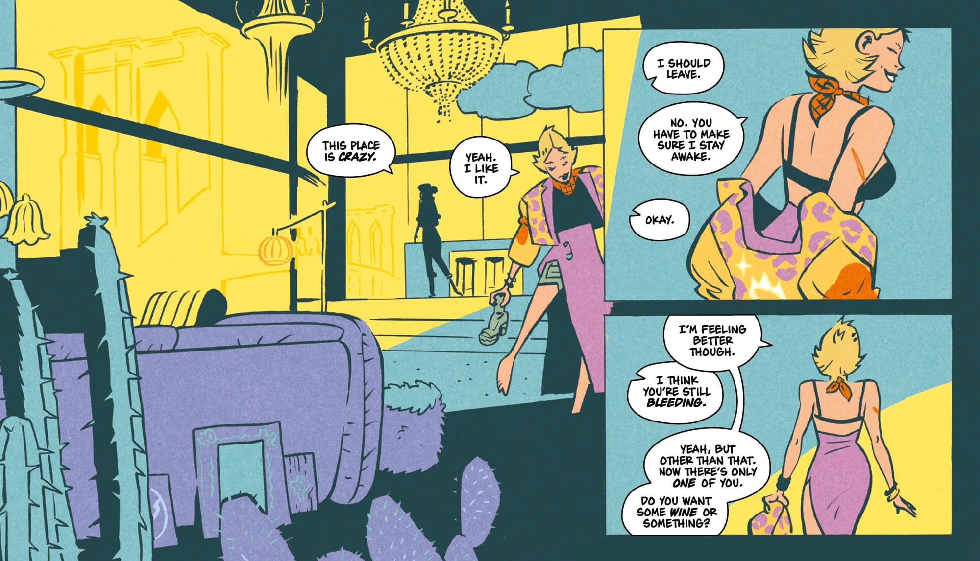
Since the art is B&W, we’ve got swathes of white, and I wanted to do something here that melds with the white background rather than standing out like a standard balloon, so most times when there’s a white background, you’ll see balloons like this – unfinished shapes with the background bleeding in. This is something I love to do whenever I can, but it looks odd on coloured artwork, with its combination of lines and white space (which would look pasted-on over colour art). On black-and-white, it actually looks naturalistic in a way that calls back to hand-lettering (my particular inspiration here would be Alex Toth, who did a lot of experiments with stuff like this).
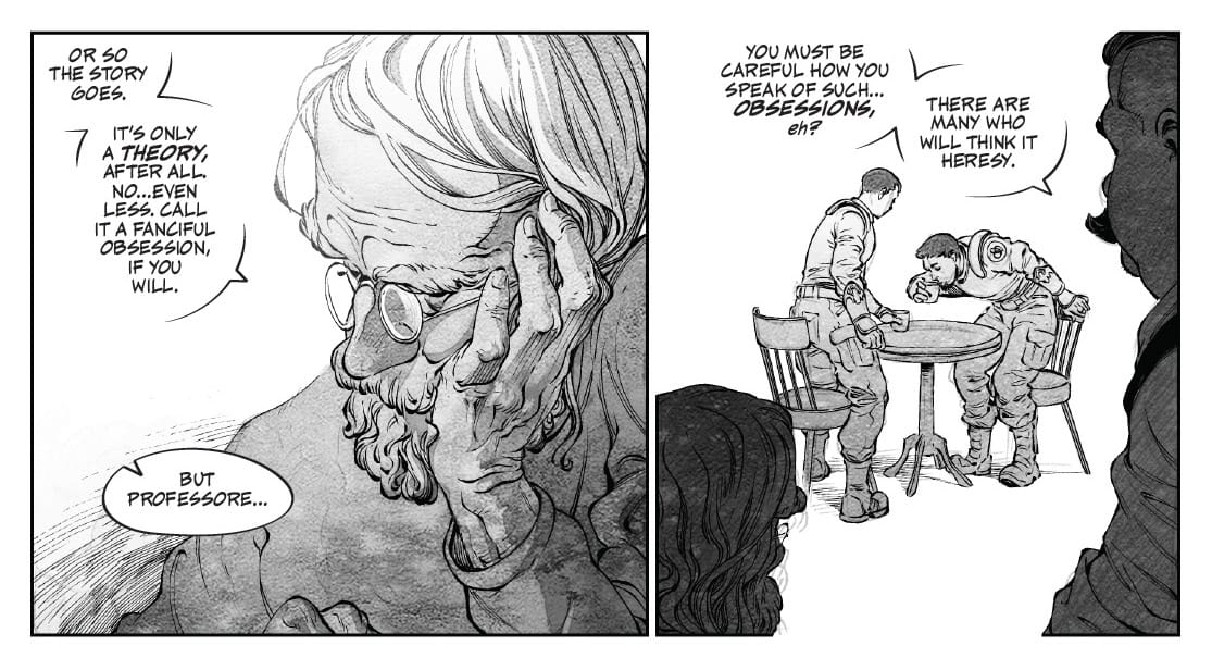
Once I’d done this over a few pages, I figured it might be interesting to use it separate the look of electric balloons from standard balloons. These are, to be honest, a fair bit of work, because I have to draw a version of the electric balloons, then duplicate it and remove bits from the lines based on where they intersect with the background. But since we’ve got a long production timeline for this book, it feels worth it. (Note the little scratchiness added to the bottom of the balloon to match the image glitching.)
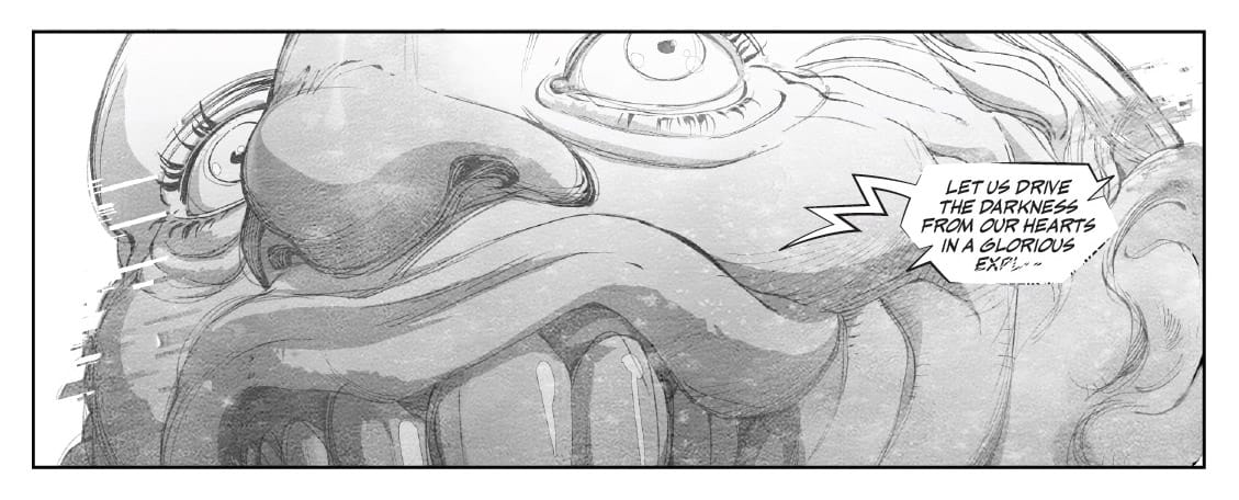
And it also made for a good border for location captions (I’d done a different style for these in the style options, but the moment we hit upon this look, we knew we had to change those).
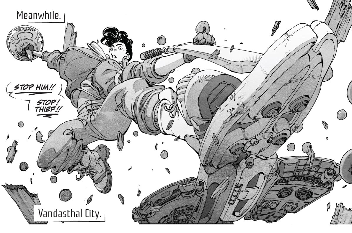
Later in the book, we have this little robot speaking, so I tried to find a way to separate how robot speech looks from human electric balloons, and I went way back in my career to VS with Iván Brandon and Esad Ribić, where I’d done a similar flying robot speech (which I’d then reused for Batman: Dark Detective) and combined it with the new border style I’d created for this book.
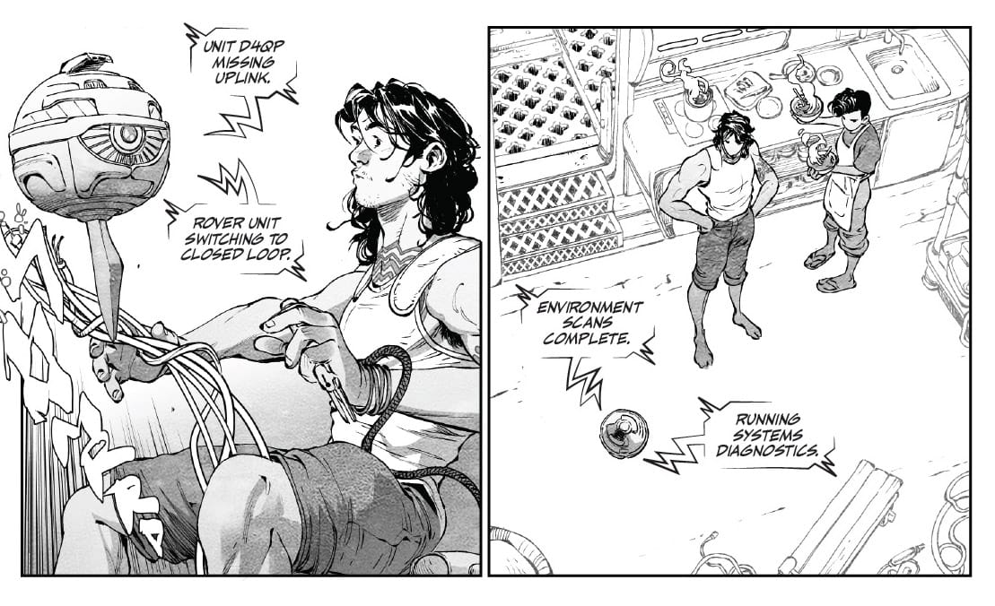
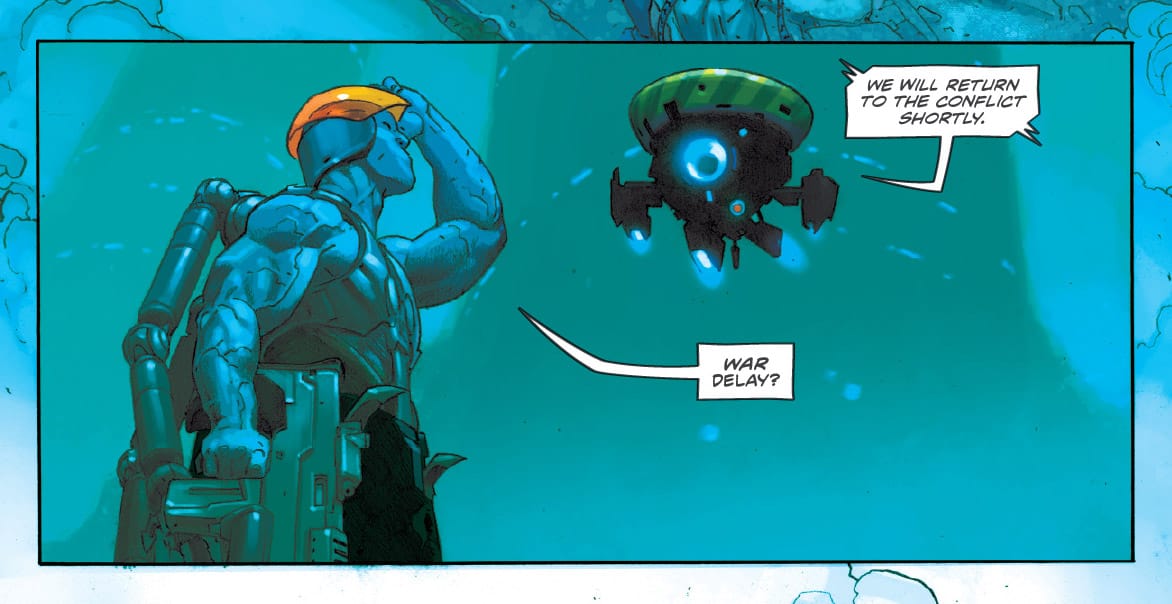
Once again, this looks particularly good over a white background, but it also works great over the B&W art.
There’s more stuff to talk about with the lettering, but it would go into spoiler territory for pages that aren’t in this preview, so I’m going to leave it at that.
Deicidium: Returned is in stores on November 11th. We’re all really proud of this book, and hope you’ll check it out!